In-Room Search Design & Testing
Symphony is a financial services platform offering encrypted, chat-based communication and workflow solutions.
Symphony’s product had powerful search capabilities, but our users lacked an obvious way to search within a specific chat room. We needed to add this much-requested feature to our product.
My Role
I was the lead designer for all search across the product. I worked closely with a product manager, engineering lead, user researcher, and one other designer.
Project Goal
Design and ship a validated, usable solution for in-room search within Symphony.
Project Process
—
Gather background and requirements
Conduct competitive research
Sketch and string together rough screen flows
Conduct usability testing with click-through prototypes
Create final designs for engineering
1. Background
—
Symphony had the ability to do in-room search, but users either did not know about them or did not use them. Why? (1) They could only use it from the global search bar, (2) there were no easy shortcuts to access it, and (3) the operator only worked for certain kinds of chats.
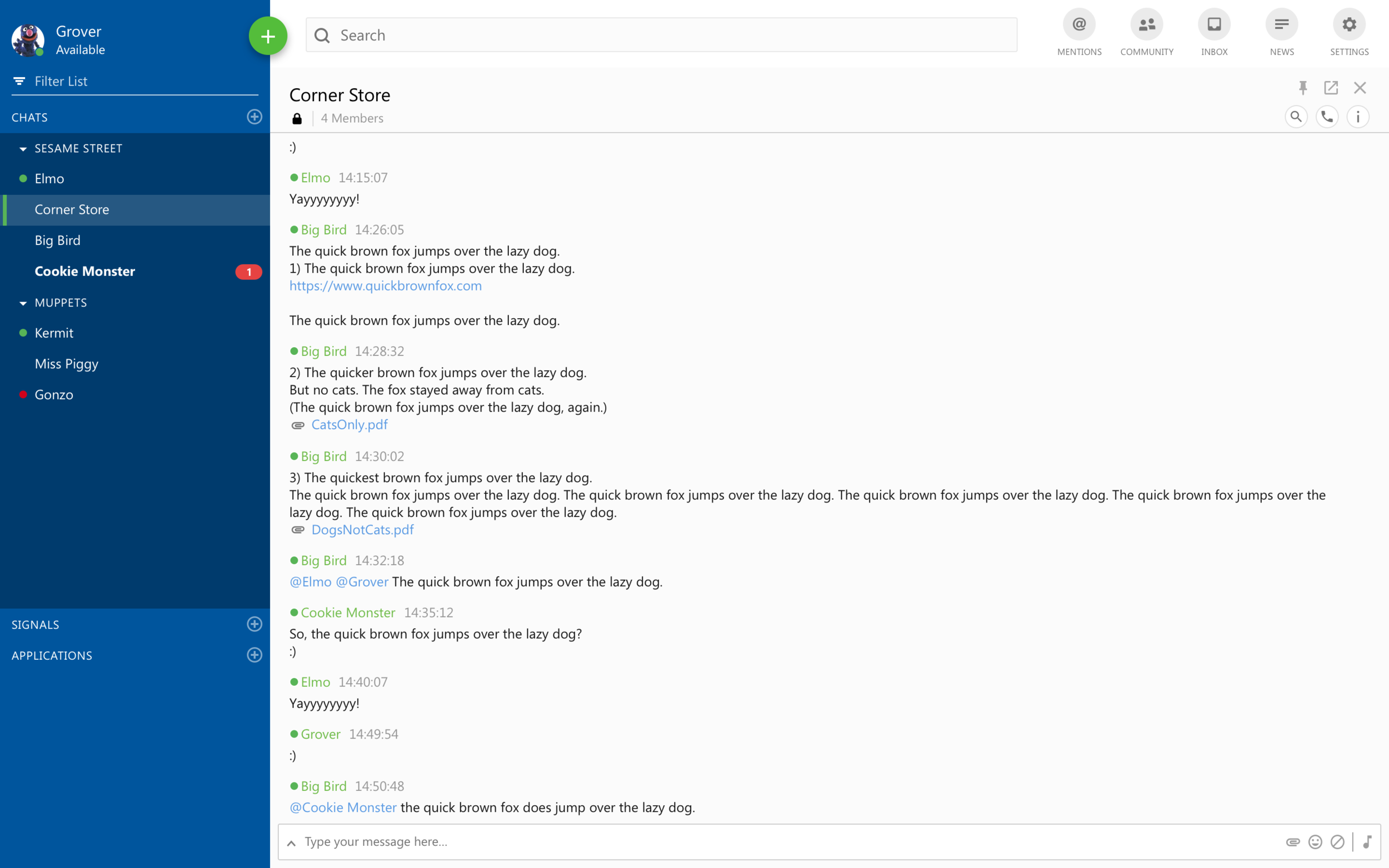
Symphony users could search within a room using operators in the global search bar.
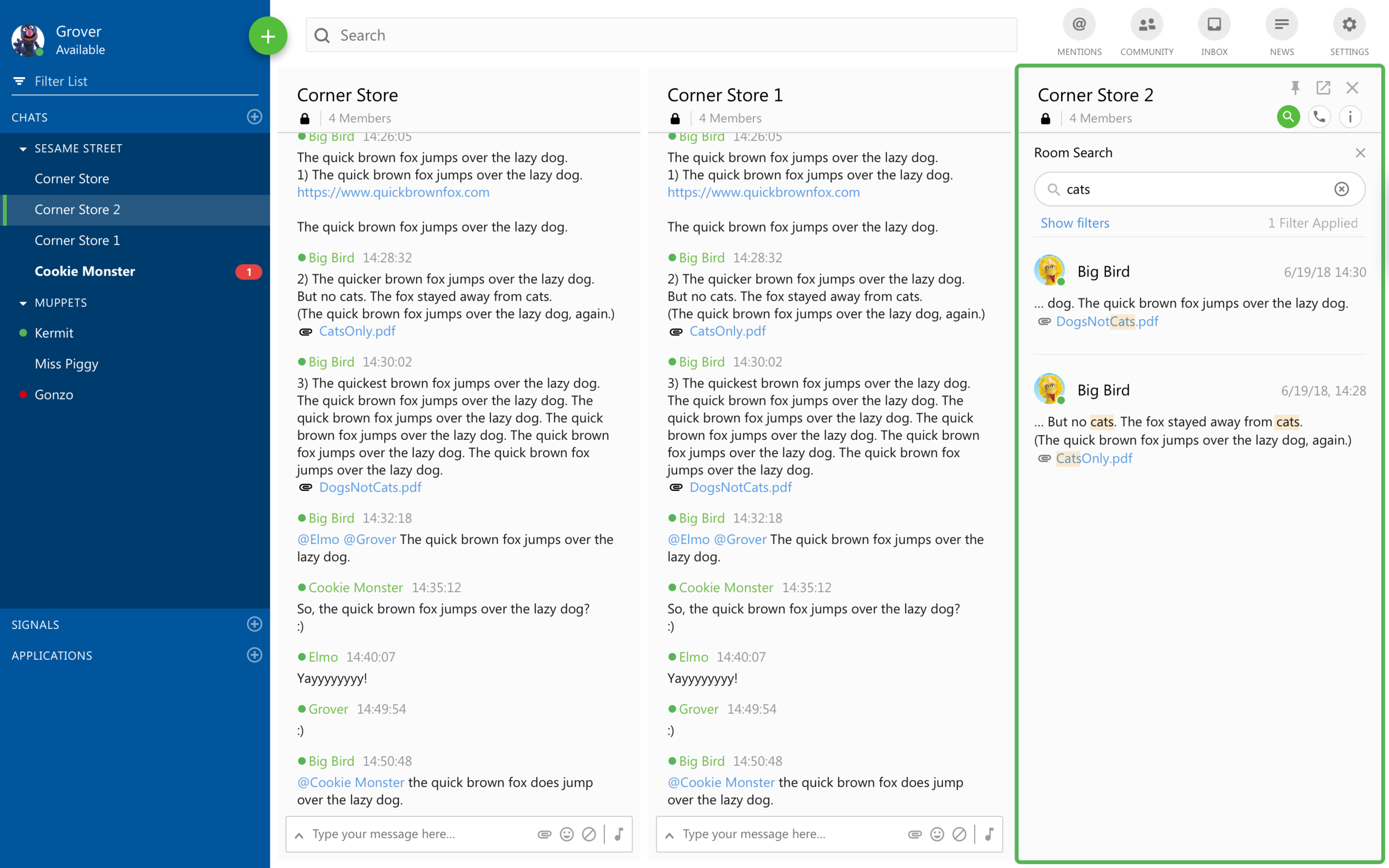
We had to create our new search feature within Symphony’s grid system. This grid helped users to see more information at once with chats, apps, and search results side-by-side. Only one search results module could appear at a time. This meant users’ global search results might appear far from the chat being searched.
Symphony’s grid in action. Multiple chat and workflow modules appear side-by-side in the same view.
2. Research
—
In analyzing our product and other competitors, I found two common ways search has been engineered:
Backend Search
The first model talks to the backend and returns a full set of results after the user explicitly asks for them. After this the user can narrow down by other parameters. This matched our existing search. However, because of our security protocols, we could only return exact matches for search terms, e.g. “app” returns “app” and not “apples, making it potentially feel broken even when it worked as we expected.
Slack’s search looks at the entirety of the content available via the backend.
Cached Search
The second model looks at and filters through cached content rather a complete backend database, making the results potentially more limited. In this case, “app” would highlight both “app” and “apples” as the user types, but they would not be able to narrow them down by any other parameters like sender or date, making it potentially less powerful.
Searching documents involves filtering
Results Models
In addition to the two models of searching, I also distilled three major ways to display in-room search results:
3. Initial Sketches
—
I combined my research findings to create a number of possible options for how we could execute in-room search within Symphony.
Design Option 1: Filtering in Place
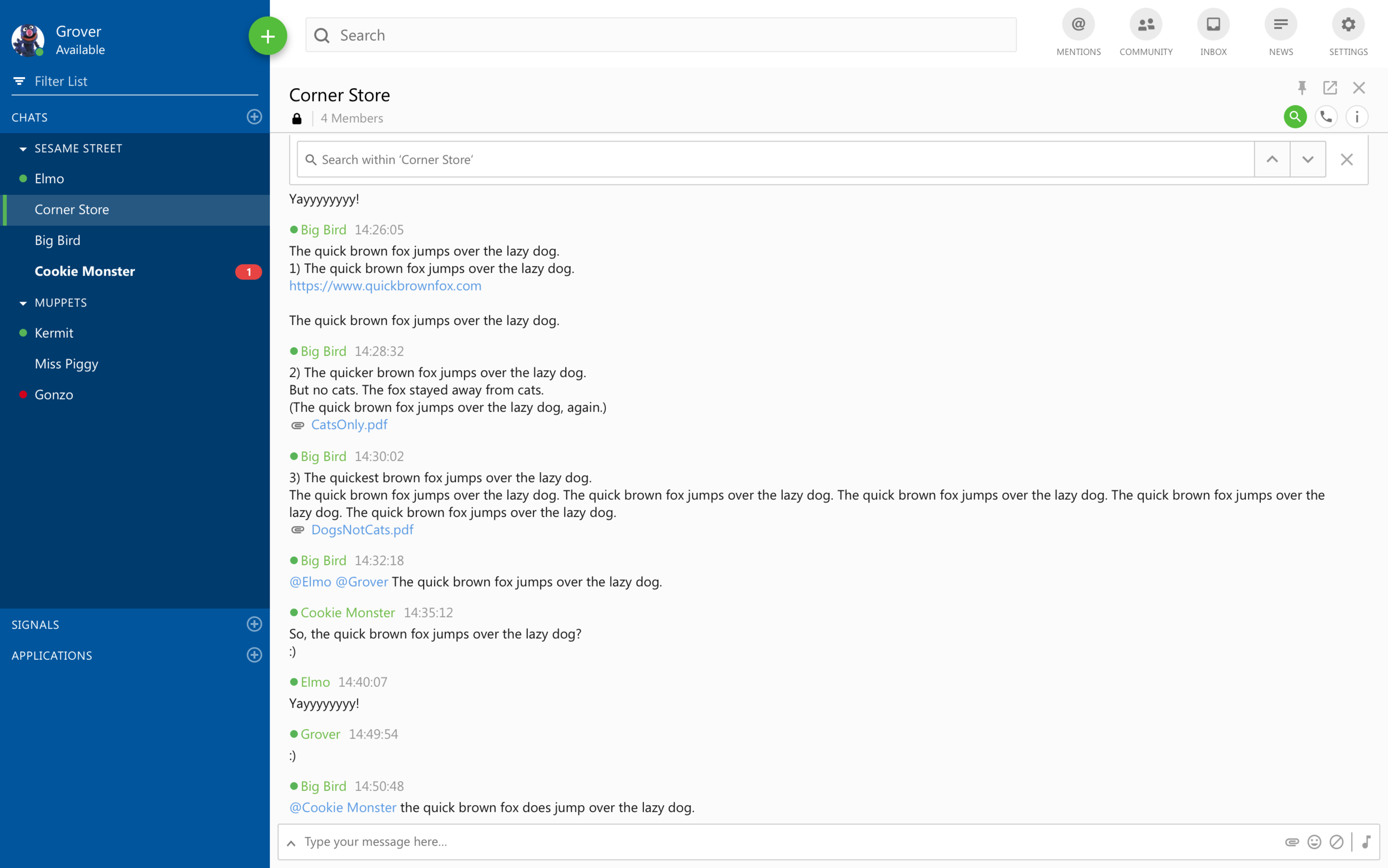
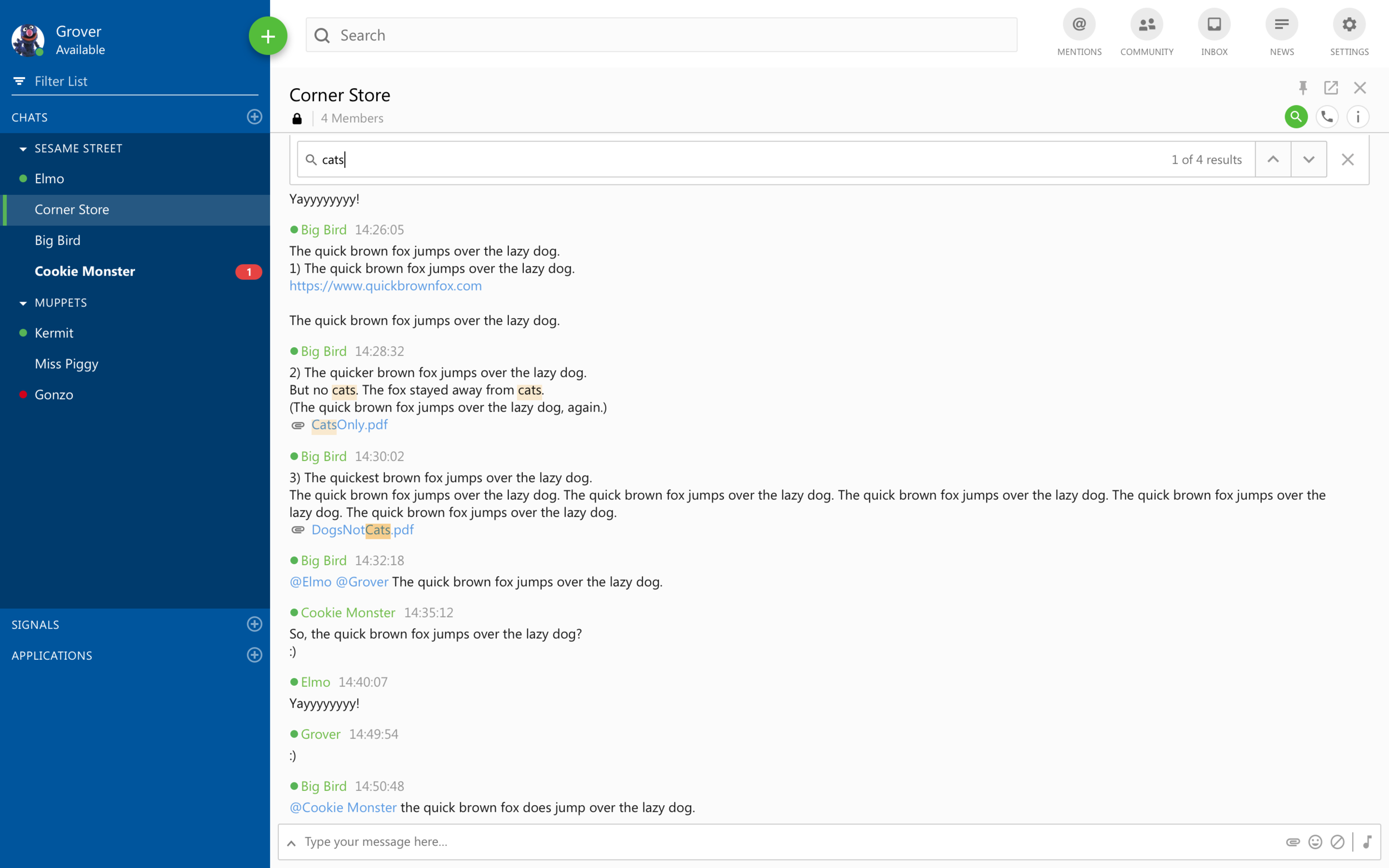
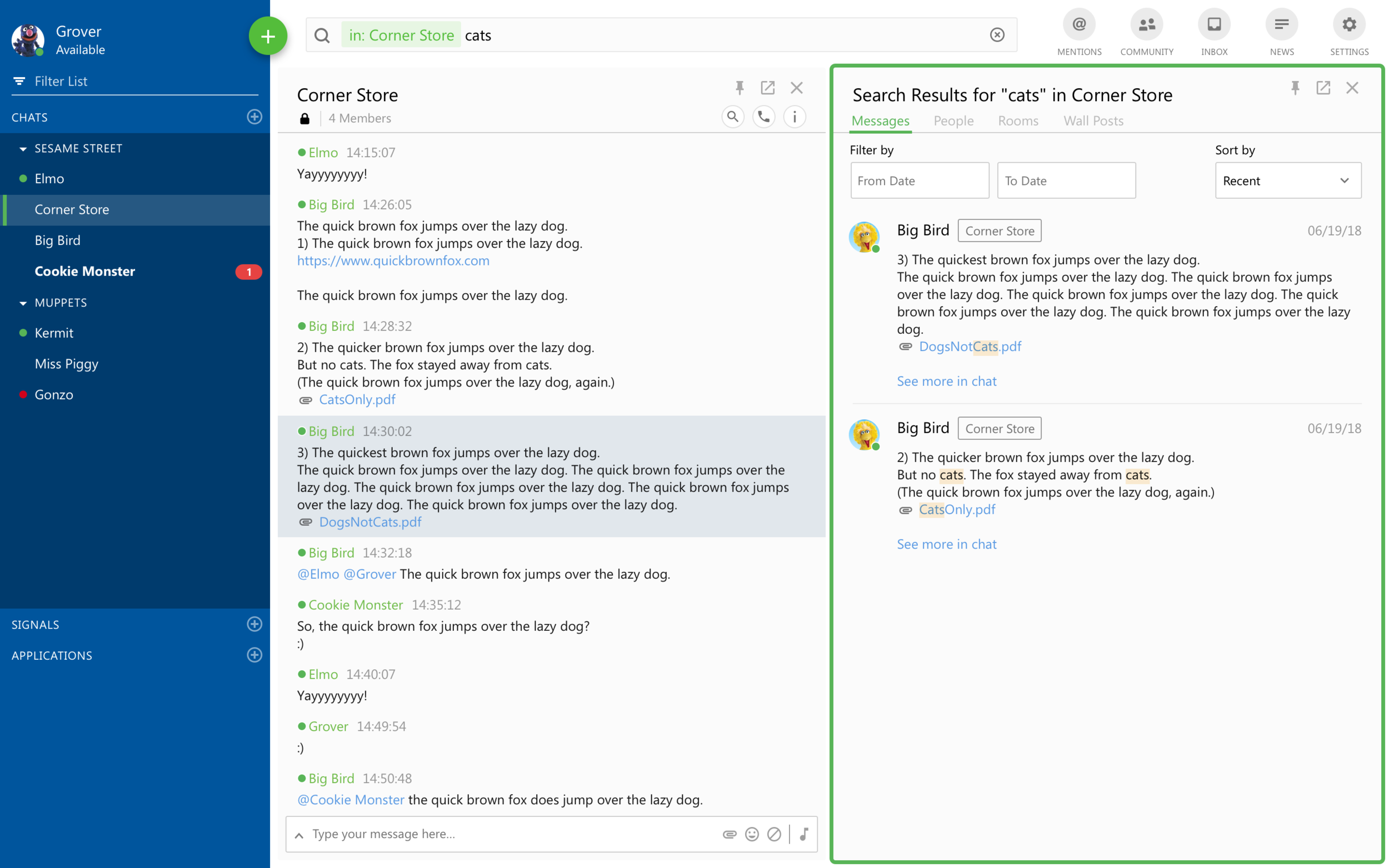
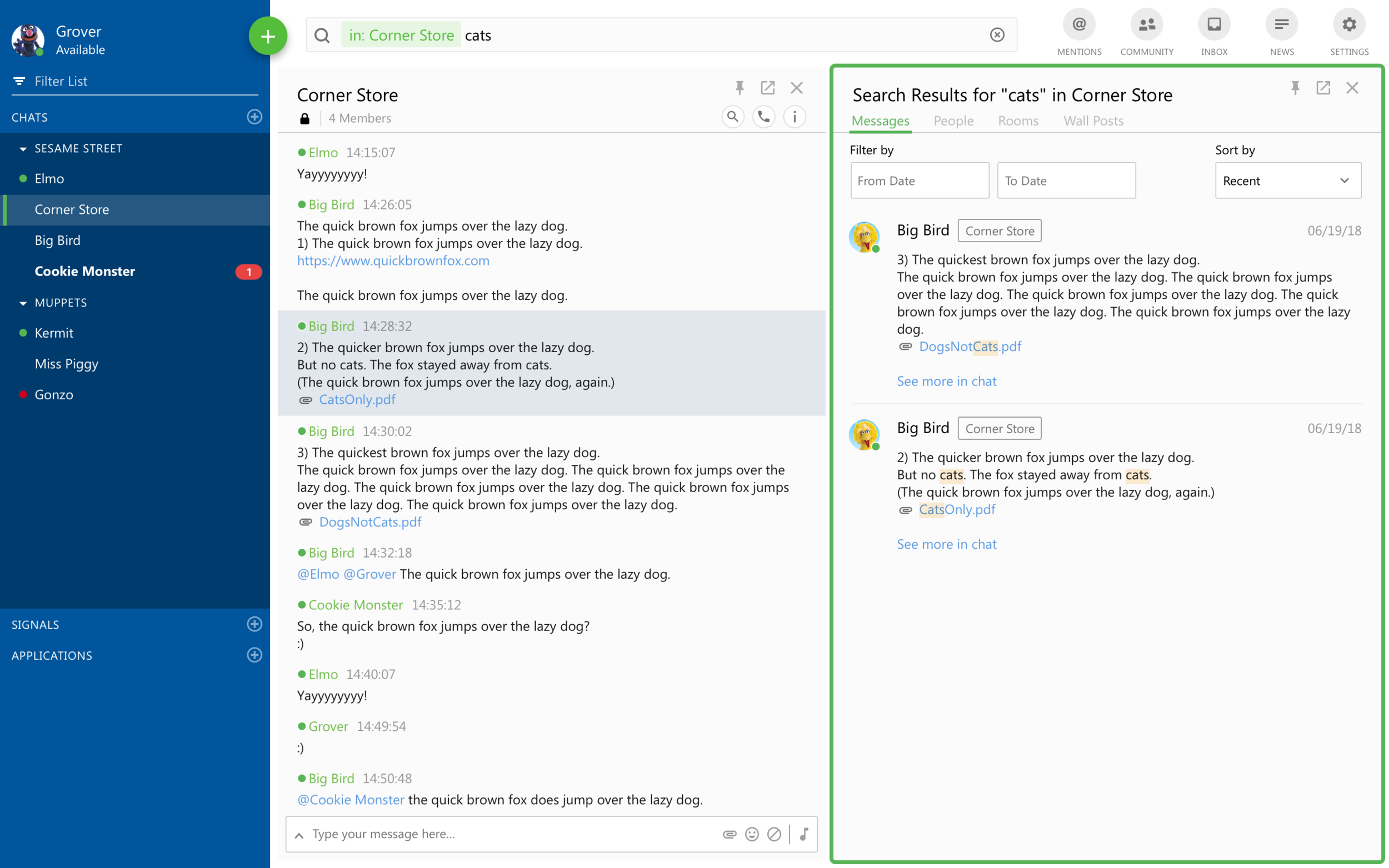
My first concept borrowed from flows of searching a web page within a browser or a word document. As the user types matching terms would highlight, and they could navigate the results within the chat.
Design Option 2: Search in Grid
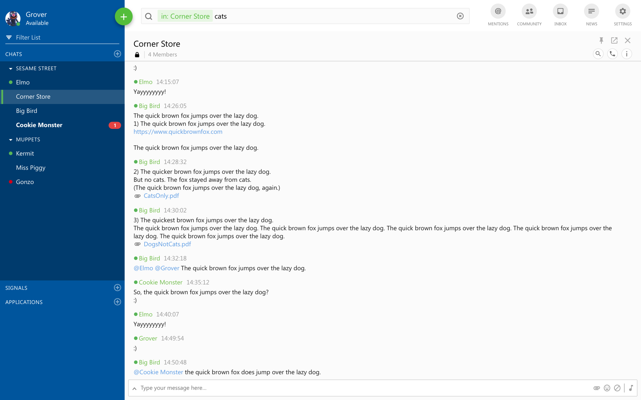
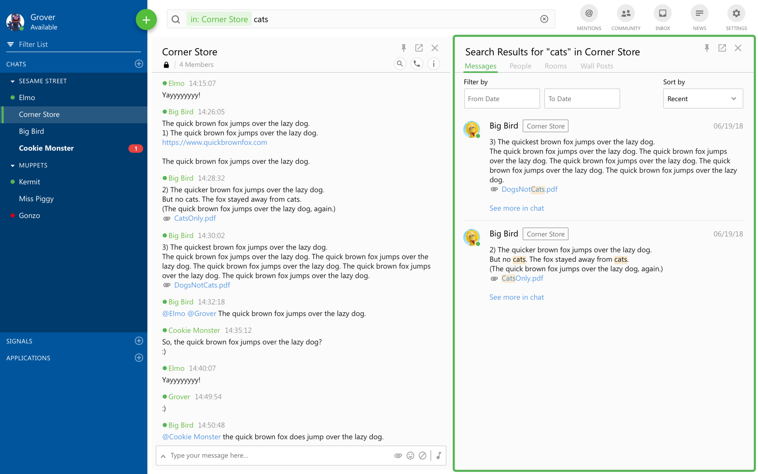
My second concept utilized Symphony’s existing search, where users typed into the global search bar and results appeared in a separate area within the grid. With a shortcut, users could learn about existing search functionality.
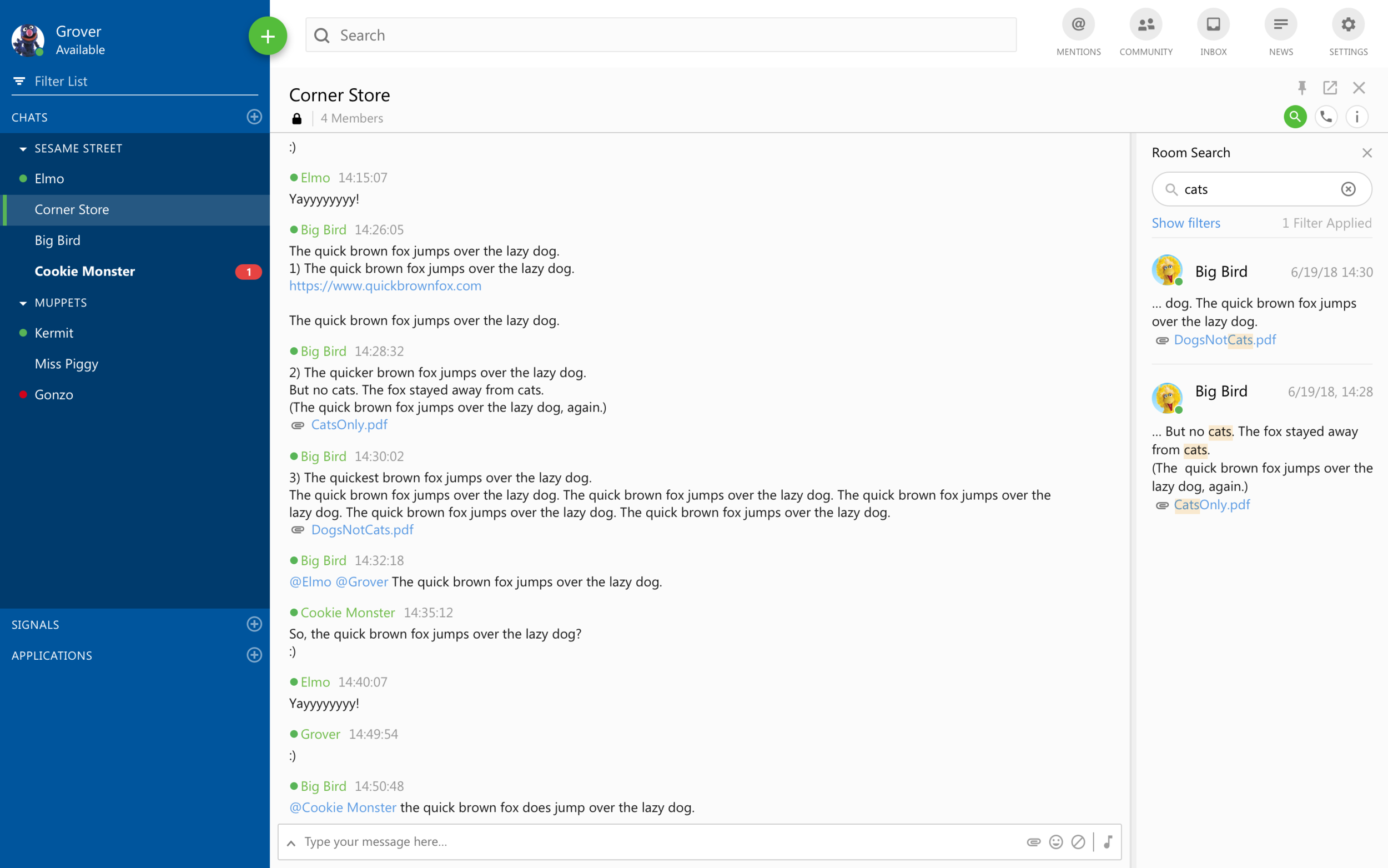
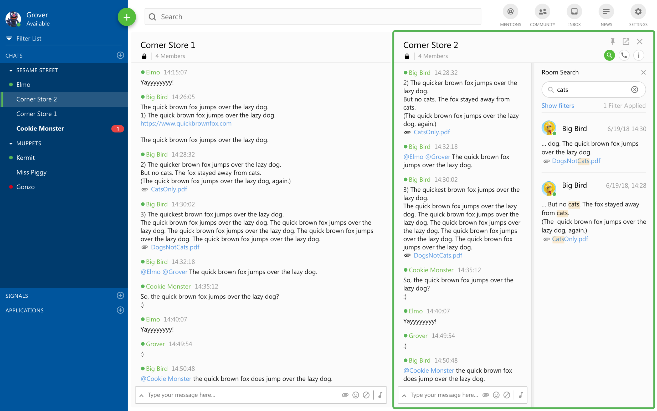
Design Option 3: Search in Sidebar
The third concept used Symphony’s backend search functionality. Instead of having the search results come up in a separate space on the grid, they were attached to the chat room the user had searched.
4. Usability Testing
—
After stakeholder feedback, I decided to turn Concept A: Filter in Place and Concept B: Search in Grid into high fidelity prototypes for usability testing. We tested with six internal users, half of whom saw Prototype A first and half of whom saw Prototype B first.
Prototype A: Filter in Place
With this prototype, I wanted to know:
Do users understand seeing results as they type?
Do users understand results in the order of the chat (starting with most recent/relevant at the bottom)?
Are users comfortable navigating chat results in place with existing noise?
Prototype B: Search in Grid
With this prototype, I wanted to know:
What is our users’ comfort level with co-opting existing Symphony behavior to search specific rooms?
Do users prefer using enter to explicitly search?
Do users expect to see their search results with most relevant or recent at the top and least relevant or recent at the bottom?
Test Results
After testing, there was no clear winner. Prototype A: Filtering in Context had a higher rating for ease and intuition, but Prototype B: Search in Grid had a higher rating for confidence in task completion.
| Confidence | Ease/Intuition | |
|---|---|---|
| Prototype A | 4.08 | 4.33 |
| Prototype B | 4.67 | 3.67 |
Looking at the top issues, it felt like we needed the simplicity and context of the first prototype but the power of the second. This led me to revisit the original third sketch of searching in the sidebar.
5. Final Designs
—
Within Symphony’s grid, chat and application windows could appear at a minimum width of 300 pixels. We documented the different potential appearances and interactions for our engineers and other stakeholders.
6. Conclusions
—
Overall, I was happy with both the process and the results of this effort. The design and testing process resulted in positive user feedback. In retrospect, I would have wanted to test the option we ended up shipping. Still, we found a middle-ground solution in terms of engineering effort, and I was able to execute a complete process including competitive analysis, multiple design cycles, and usability testing.


